How to use Webflow components to give marketing teams more control
Learn how Webflow components, properties, slots and variants give marketing teams safer control without turning every website update into developer work.
August 3, 2026
A scalable Webflow website should not force the marketing team to choose between two bad options: asking a developer for every small change or editing the underlying layout and risking inconsistency.
Reusable components create a better boundary.
The developer controls structure, responsive behavior and the design system. The marketing team controls the content and approved options exposed through component properties.
That is how we use Webflow components to give clients more independence without turning the website into an unrestricted page builder.
What are Webflow components?
Webflow components are reusable blocks of elements, styles and interactions that can be used across a site and maintained from a shared main component.
Webflow supports several ways to make individual instances flexible. Component properties can expose editable text, images, links, videos, numbers, visibility settings and Collection List settings. Slots allow approved components to be placed inside another component. Variants provide predefined visual or layout alternatives.
The current Webflow components overview describes components as a way to maintain recurring layouts efficiently while allowing unique content and controlled variations between instances.
Why this matters to marketing teams
A marketing team usually needs to make frequent changes after launch:
- Update headlines and descriptions.
- Replace images.
- Change links and calls to action.
- Show or hide optional elements.
- Create new campaign pages.
- Reuse approved cards and sections.
- Adjust which CMS content appears in a section.
None of those tasks should require rebuilding the component structure every time.
At the same time, the team should not need to understand class architecture, responsive CSS or the internal logic behind the section.
The component becomes the boundary between those two responsibilities.
Use properties for safe content control
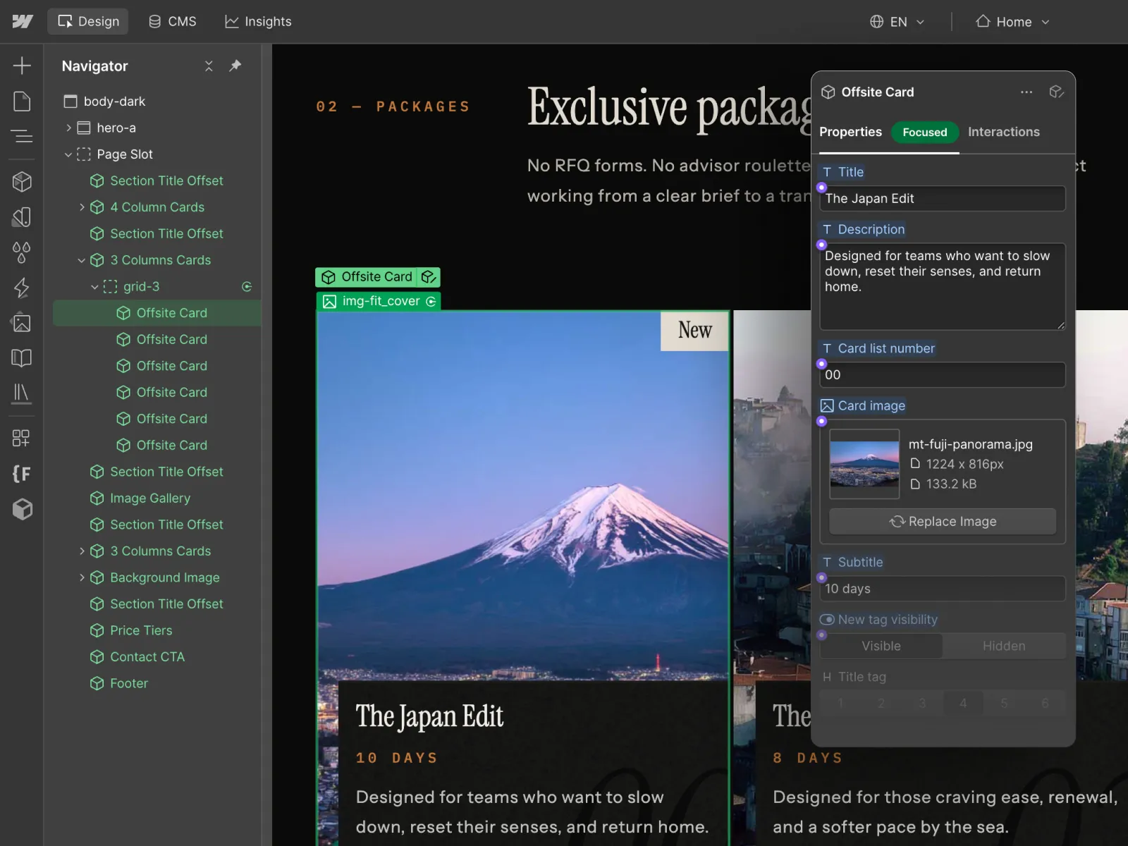
Component properties are the most direct way to expose editable values while keeping the underlying structure protected.
For example, a card component can expose:
- Title.
- Description.
- Image.
- Link.
- Subtitle.
- Badge text.
- Visibility of an optional tag.
The marketer sees a small set of understandable fields instead of the complete Navigator, class structure and responsive setup.
This is exactly the distinction visible in the component interface shown above: the card keeps the same layout, while the content and approved options can change from one instance to another.
Webflow's component properties documentation supports this pattern by allowing specific values inside a recurring component to be overridden per instance.
Use visibility properties instead of deleting elements
Optional content is common on real websites.
One card may need a label. Another may not. One hero may include supporting text. Another may need a simpler layout.
Without a system, editors often solve this by deleting elements, duplicating sections or creating one-off classes.
A safer approach is to expose a visibility switch for optional elements. The editor chooses whether the approved element appears, while the component structure remains intact.
This gives the team flexibility without encouraging structural edits.
Use variants for approved design alternatives
Sometimes the difference between two uses of a component is not content but presentation.
A button may need solid and outline versions. A card may need horizontal and vertical layouts. A section may have light and dark visual treatments.
Creating separate components for every small variation creates unnecessary duplication.
Webflow variants allow the main component to contain predefined style and layout alternatives, then expose the choice at the instance level. The current component variants documentation supports this model.
The important principle is that the alternatives are designed in advance. Marketing chooses from approved variants instead of inventing a new design each time.
Use slots when the component needs modular content
Properties work well when the type of content is predictable. Slots are useful when the internal content needs more flexibility.
For example, a reusable feature section might contain a fixed heading area and a slot where an approved card group, testimonial component or media block can be inserted.
Webflow describes slots as placeholders for other components, allowing components to be built more modularly. See the official slots documentation.
Slots are powerful, but they should still be constrained. The goal is not to recreate an unrestricted canvas inside every component.
What should become a component?
Not every section needs to be reusable.
We usually create components around patterns that appear repeatedly or need centralized control:
- Navigation and footer systems.
- Calls to action.
- Hero patterns.
- Cards.
- Testimonials.
- Forms.
- Logo rows.
- Pricing and comparison modules.
- Reusable campaign sections.
A component should reduce future work. If a section is genuinely unique and unlikely to appear again, turning it into a heavily configurable universal component can make the project harder to understand rather than easier.
This broader architectural principle is covered in our article on what makes a clean Webflow build.
Components and CMS solve different problems
Components control reusable presentation. CMS controls reusable structured content.
These systems often work together, but they are not interchangeable.
For example, a case study should usually exist as a CMS item because the business needs to manage its title, industry, services, images and results as structured data.
The card that displays that case study can be a reusable component.
This separation matters because it keeps content ownership and design ownership clear.
Our guide to Webflow CMS architecture explains how collections, references and editor safeguards support the content side of that system.
What marketing should control
A useful component system gives non-technical users control over decisions they actually need to make.
Typical marketing controls include:
- Text and media.
- Links and CTA labels.
- Visibility of optional content.
- Approved layout or style variants.
- Selected CMS items.
- Ordering where the component is designed to support it.
What should remain developer-controlled
Marketing independence does not mean exposing every implementation detail.
We generally keep these areas controlled by the development system:
- Class structure.
- Responsive layout logic.
- Spacing systems.
- Typography rules.
- Core component structure.
- Custom JavaScript and integrations.
- New structural patterns that do not exist in the design system.
This is an important boundary. A marketer should be able to change the website without needing development knowledge, but creating a genuinely new section is still development work.
Why unrestricted flexibility creates technical debt
It is tempting to expose every property possible because more options appear more flexible.
In practice, too much flexibility recreates the same problems components are meant to solve:
- Different instances slowly stop looking related.
- Editors create combinations that were never designed.
- Responsive behavior becomes unpredictable.
- Future redesigns become harder because every instance has unique exceptions.
- The system becomes difficult to explain during handoff.
The best component systems are opinionated. They expose the decisions the team needs while protecting everything else.
How we structure component handoff
Before handoff, we test components with real content and realistic edge cases rather than only polished design samples.
That includes:
- Long and short titles.
- Missing optional elements.
- Different image ratios where supported.
- Each approved variant.
- Mobile and tablet behavior.
- CMS-connected states.
- Empty and maximum-content cases.
We then show the client which properties are safe to change and where a developer should become involved.
This is part of our Webflow development approach: the website should remain understandable and practical after launch, not only look correct on delivery day.
The goal is controlled independence
A scalable Webflow website is not one where the client can edit absolutely everything.
It is one where the team can control the things they need to change frequently without damaging the system underneath.
Components, properties, slots and variants make that possible when they are designed around real editorial workflows rather than added as technical features for their own sake.
The result is less developer dependency for routine marketing work, while the website remains consistent, responsive and maintainable as it grows.